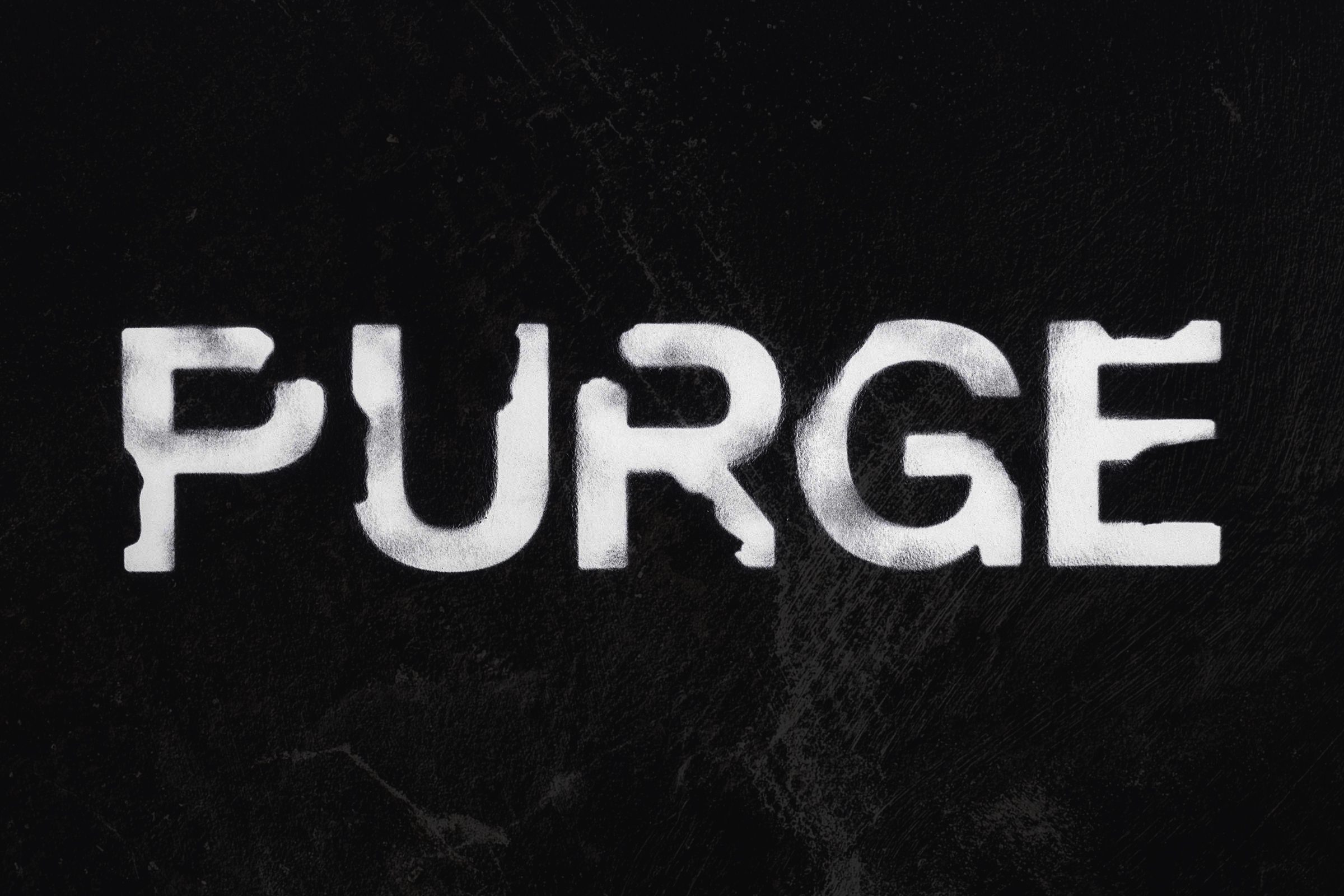
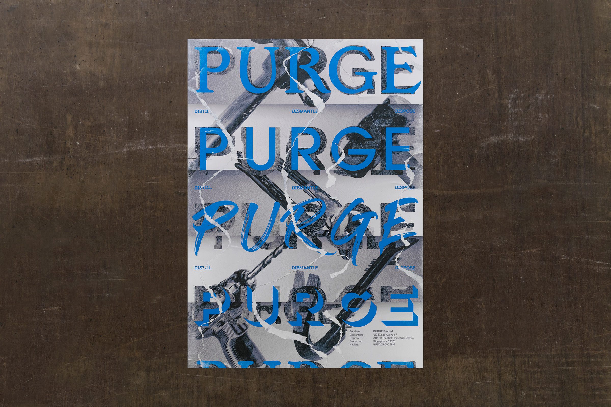
PURGE is a Singapore-based demolition team that transforms spaces by removing the unnecessary, creating a clear path for construction. The brand name reflects this mission: stripping back, dismantling, and revealing what truly matters.
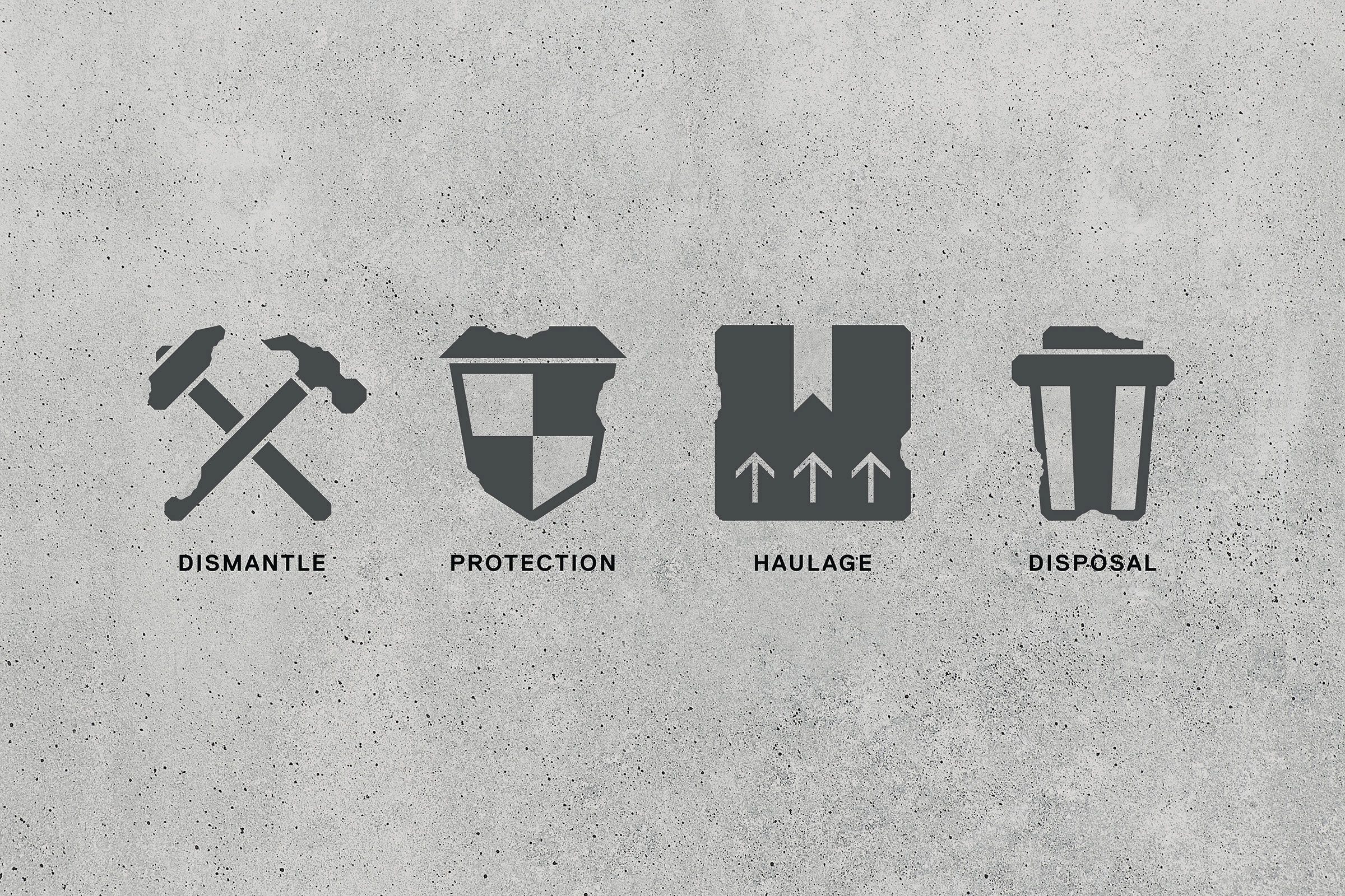
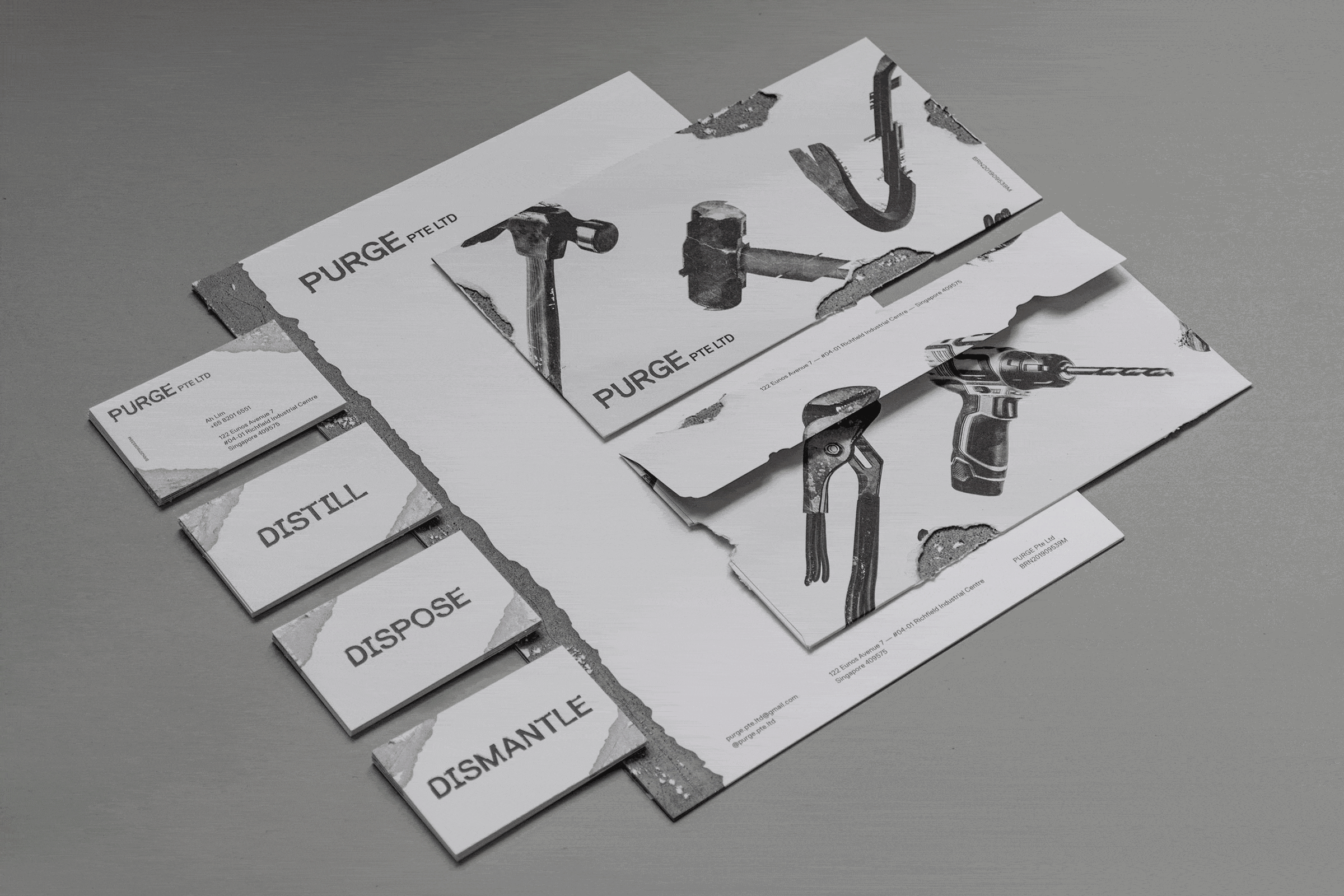
Their services include object dismantling, spatial protection, haulage, and waste disposal. These tasks can be messy and unrefined, yet the brand embraces the authenticity of the process. Knocked-down walls inspired the brand’s visual language, establishing a raw, work-in-progress aesthetic.
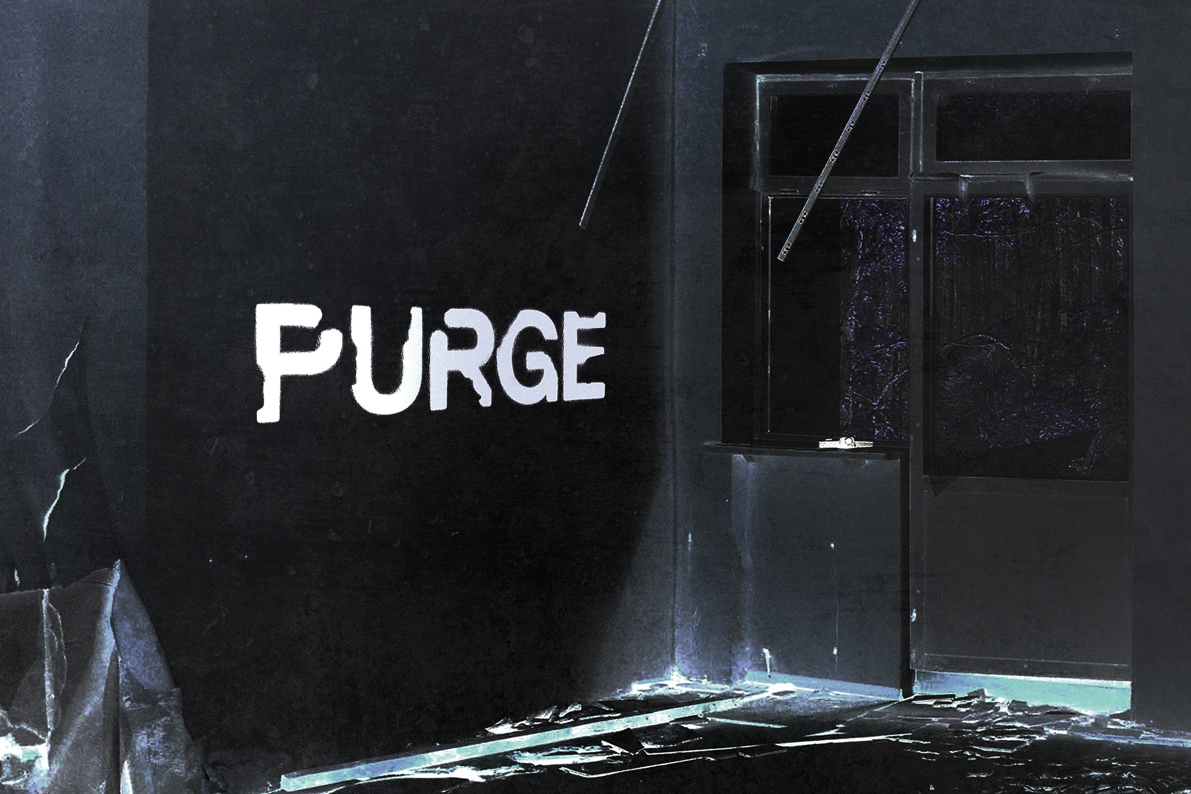
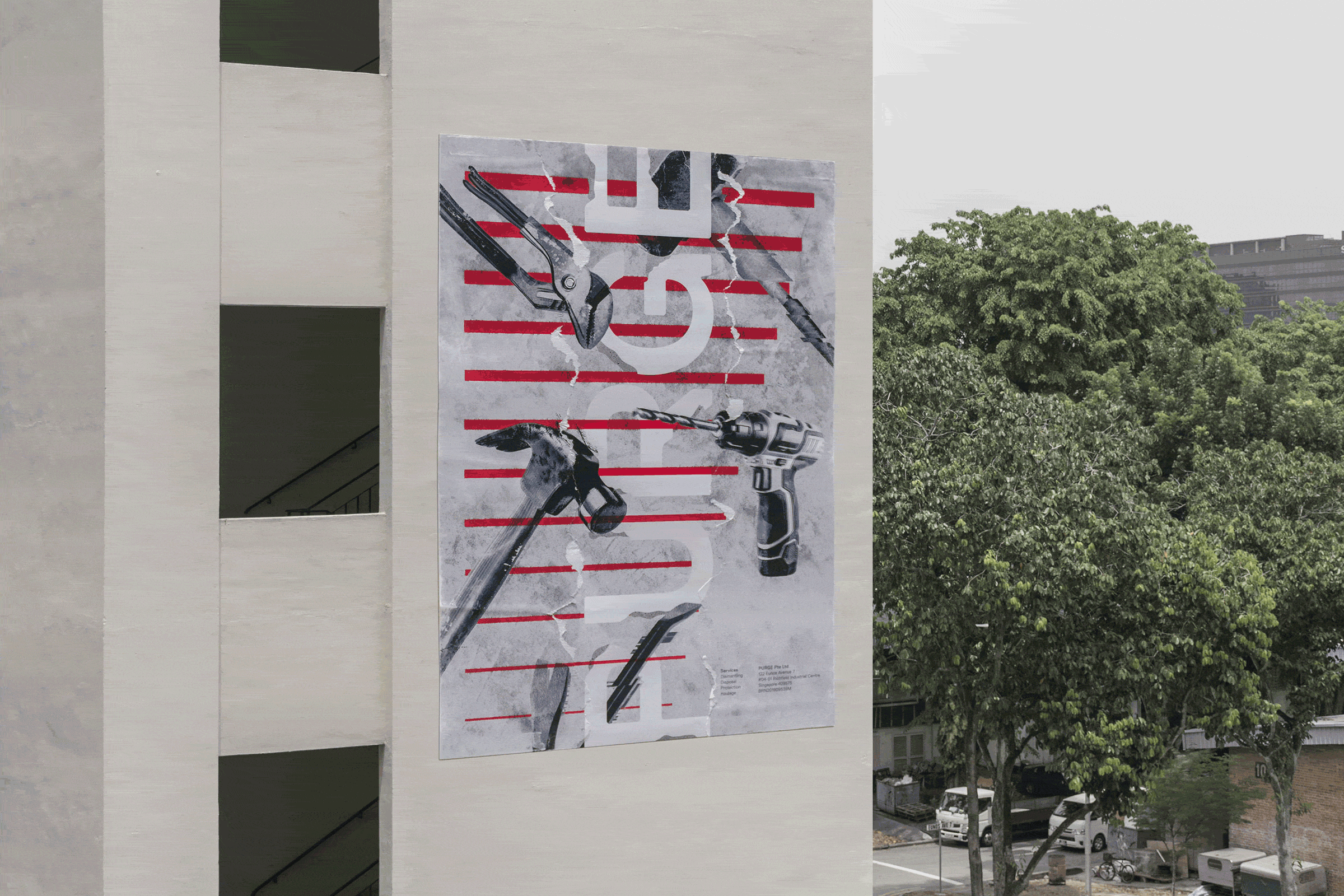
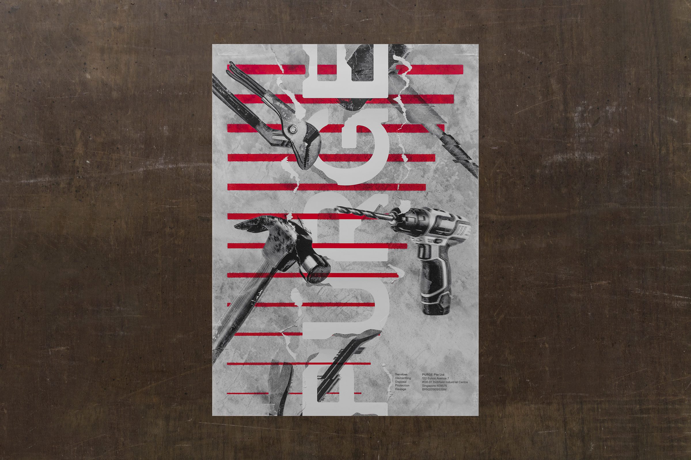
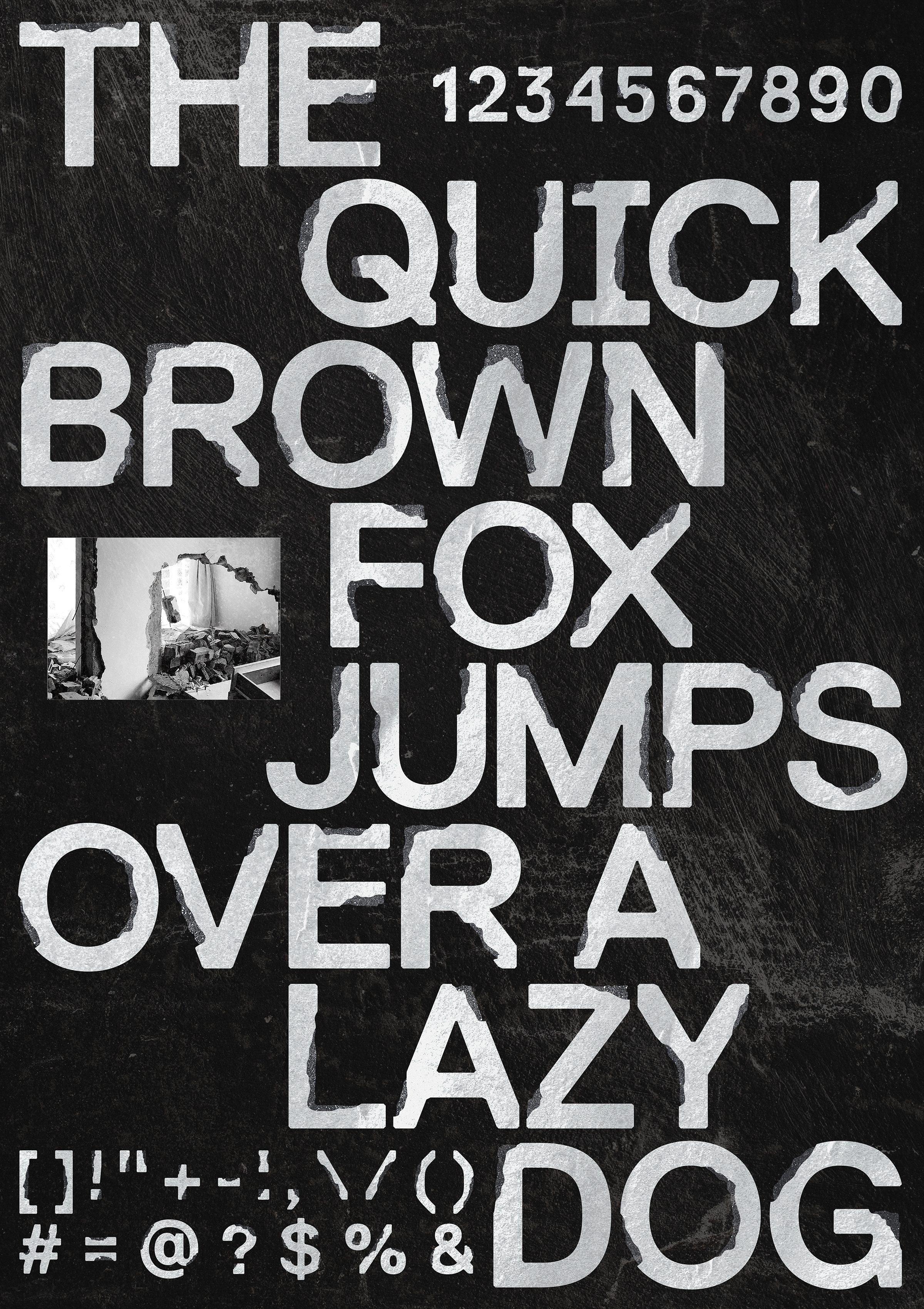
The identity design applies intricate ‘knockings’ to an industrial typeface, exposing the concrete beneath and creating a textured, camouflaged effect across the letters.
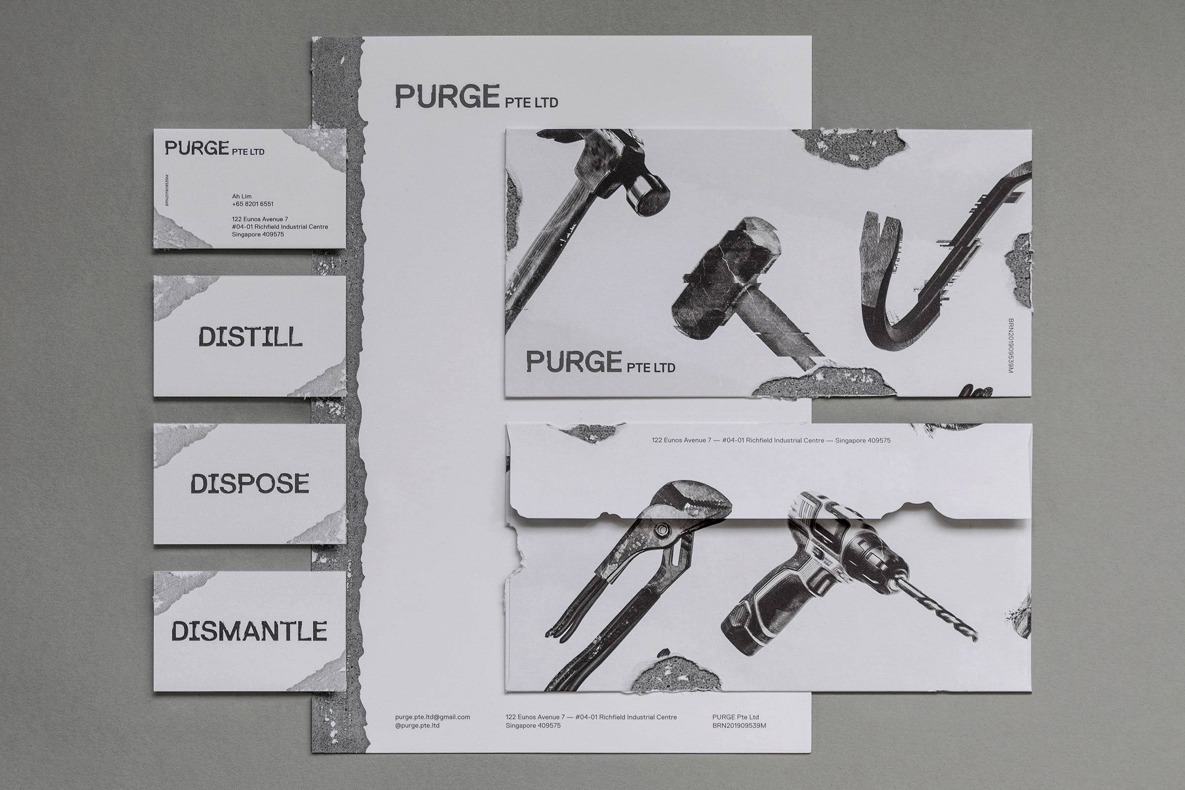
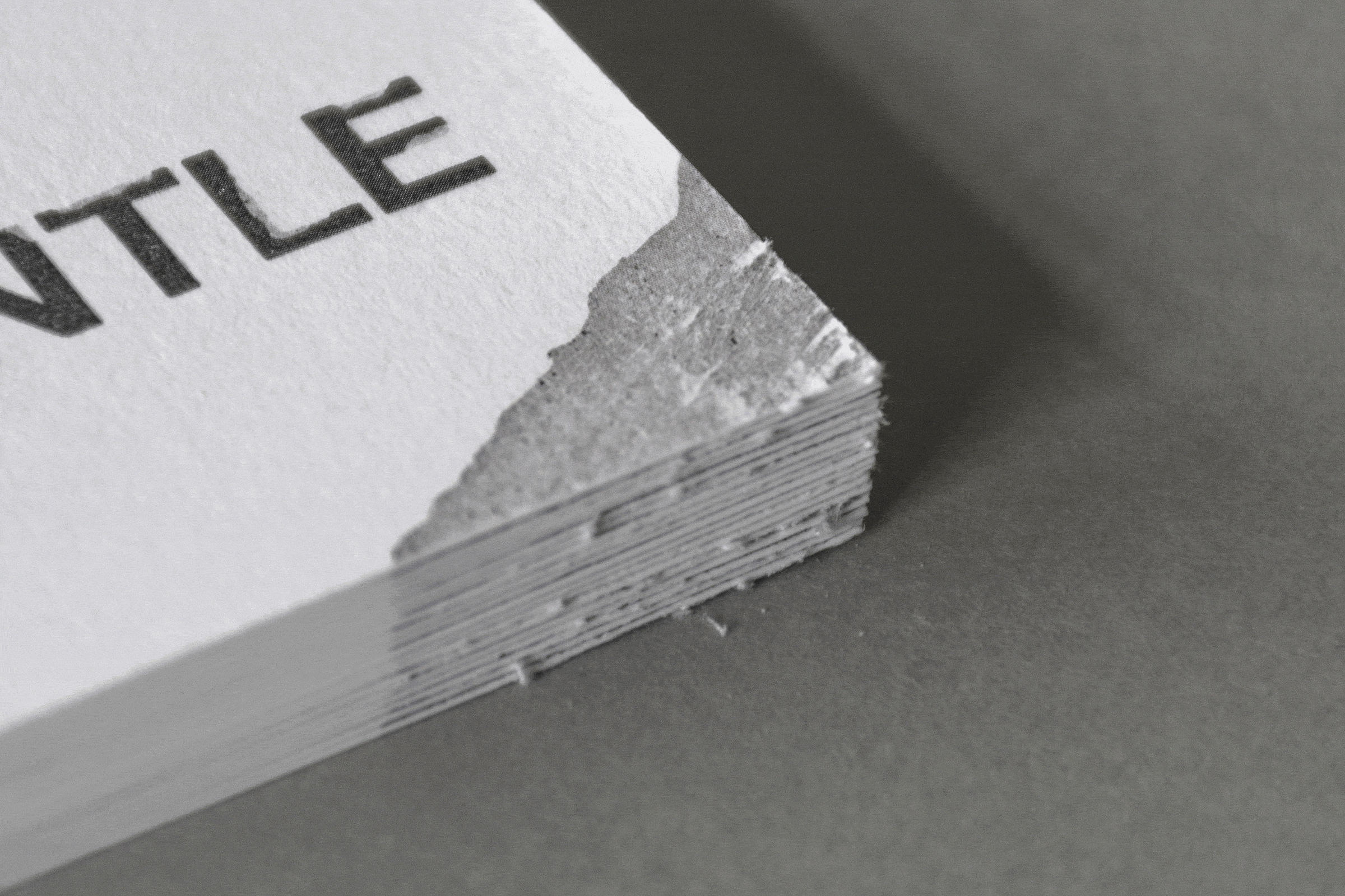
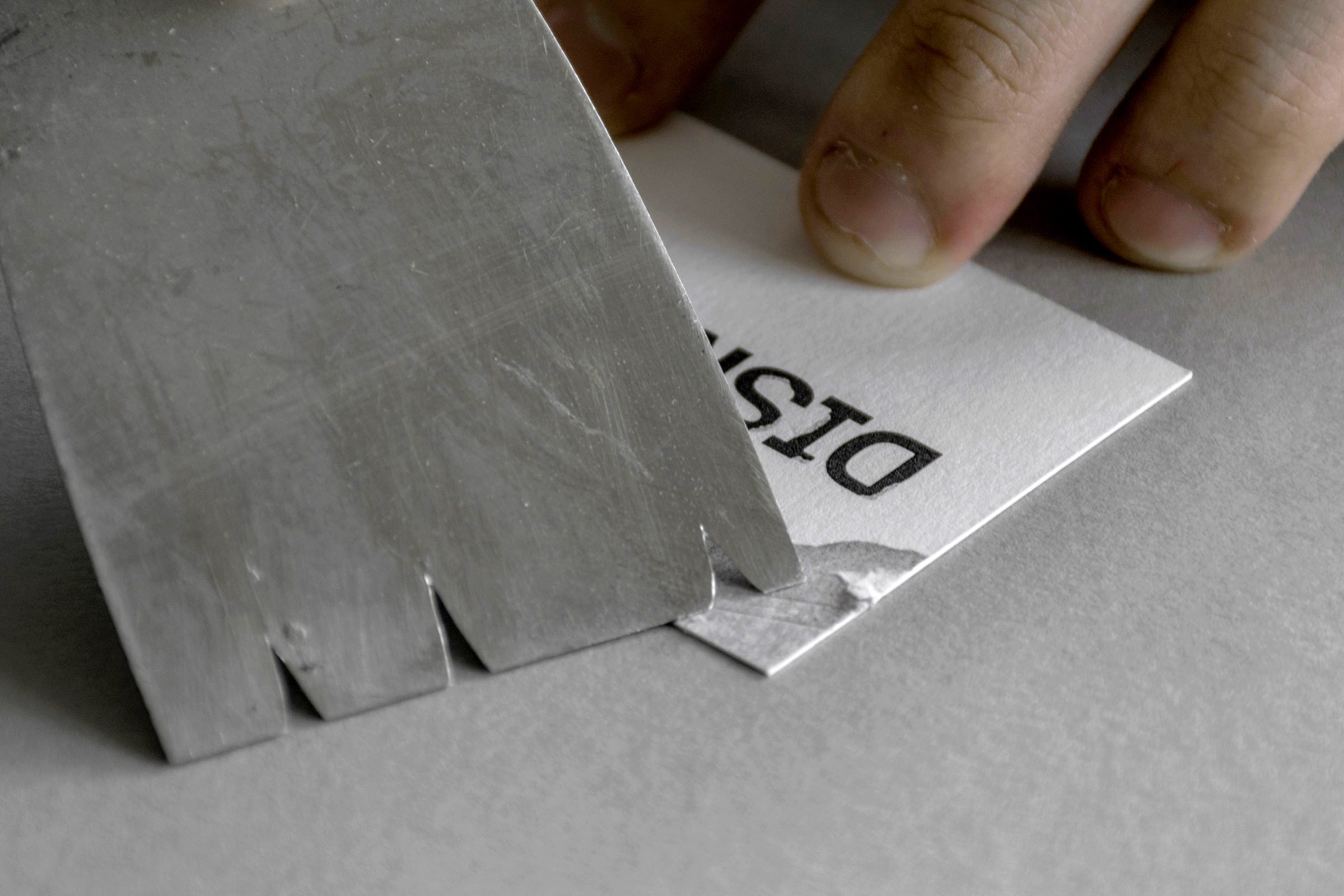
This idea continues through the stationery, where hand-distressed textures make each piece unique. Envelopes are manually dismantled to reveal layered details within, reflecting the same philosophy of uncovering.
Large typographic posters highlight PURGE’s attention to detail and are sent to prospective collaborators. Refined paper swatches, mimicking wall textures, are paired with offset printing to reflect the brand’s commitment to quality.
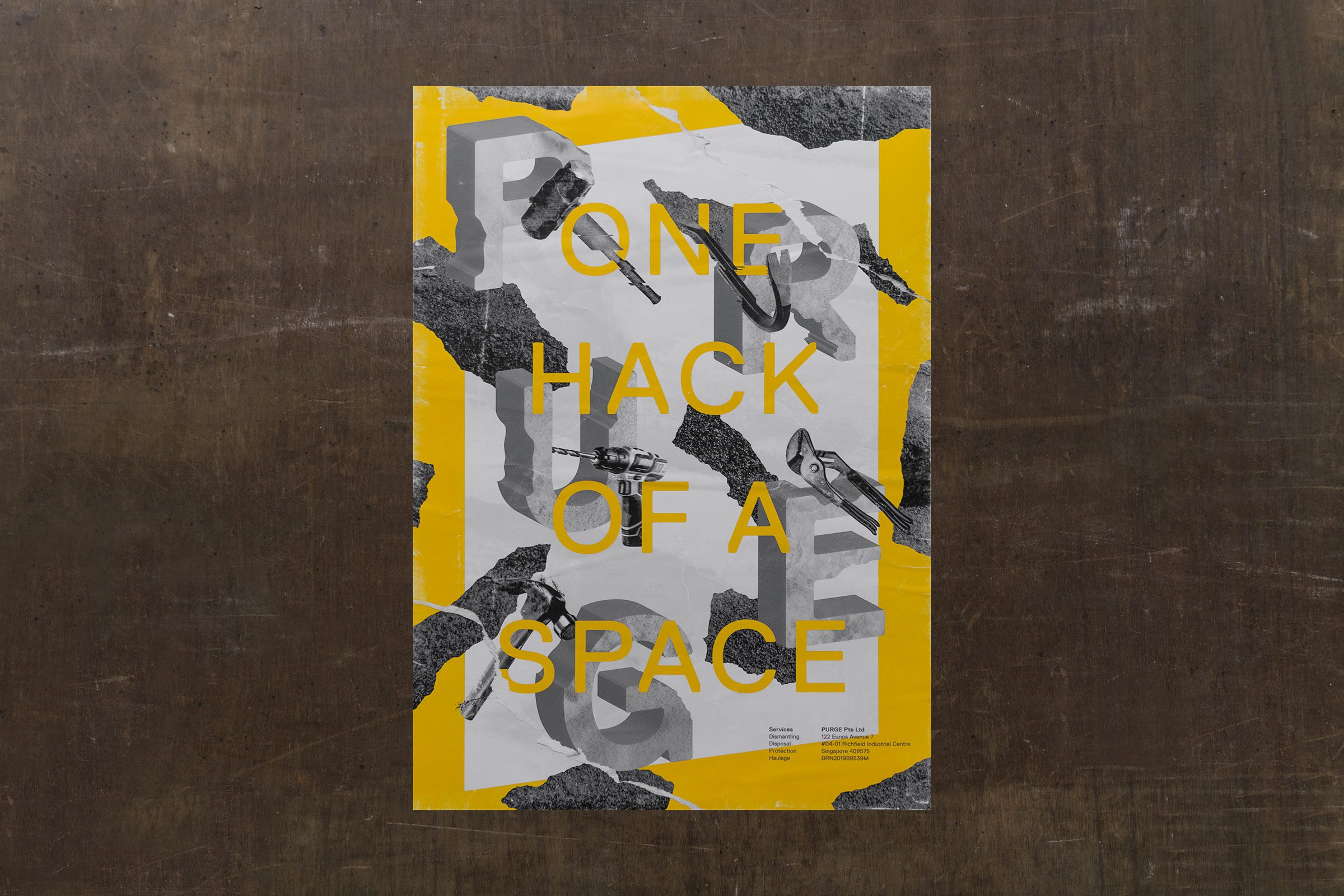

PURGE—Providing One Hack of a Space.
Completed in 2020.
Photography by House of Adjaycent.