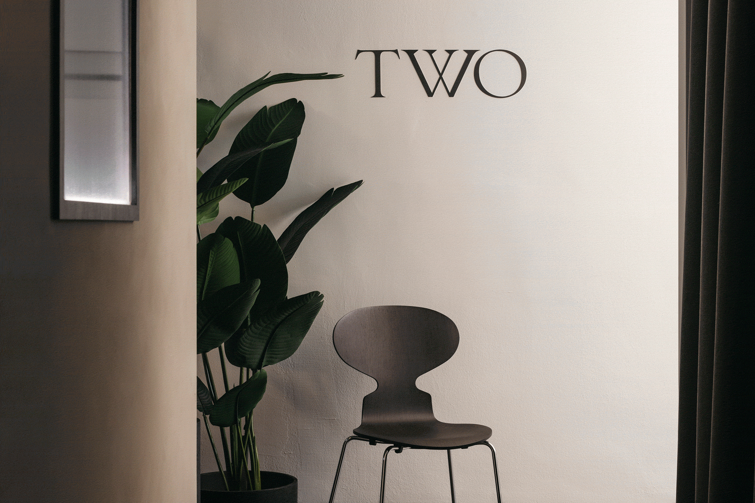
Situated within the conservation shophouses of Duxton Hill in Singapore, Twomorrow is a newly launched fine jewellery brand that seeks to redefine the idea of perfection. They offer a curated selection of unconventional diamonds, reminding everyone that they are one-of-a-kind.
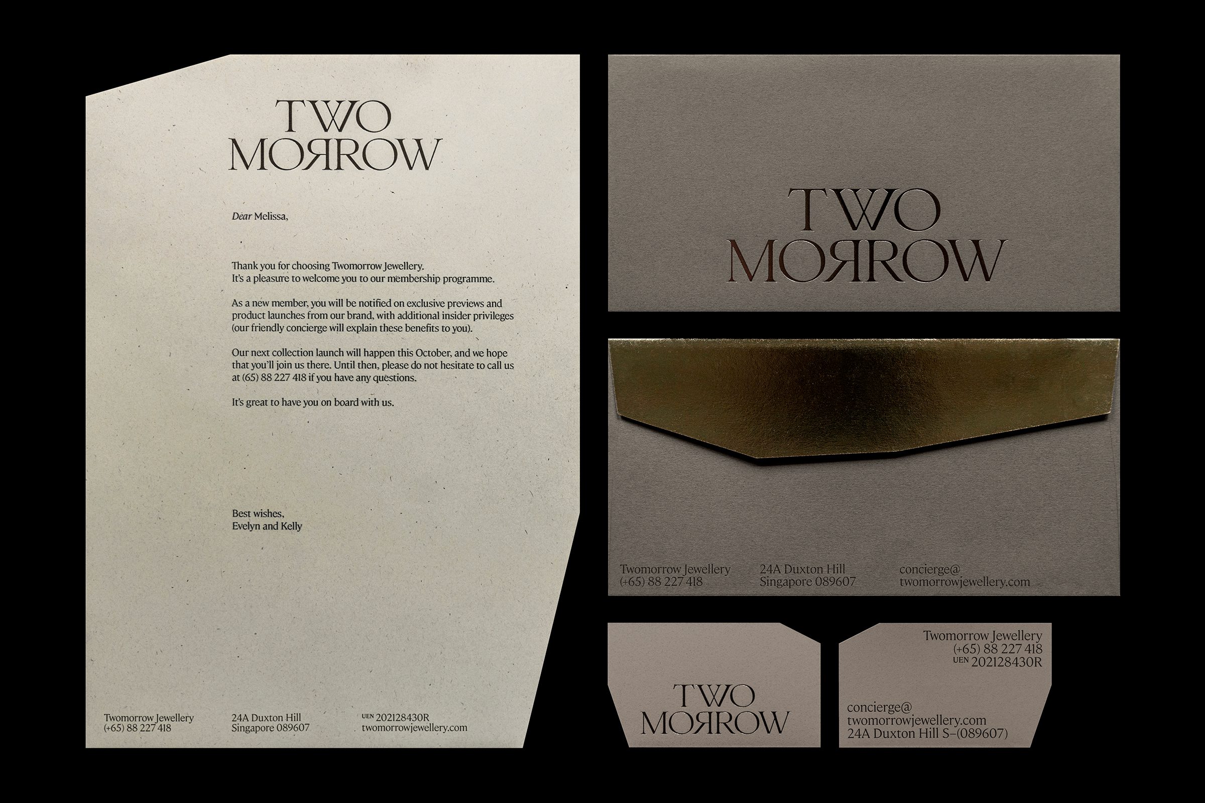
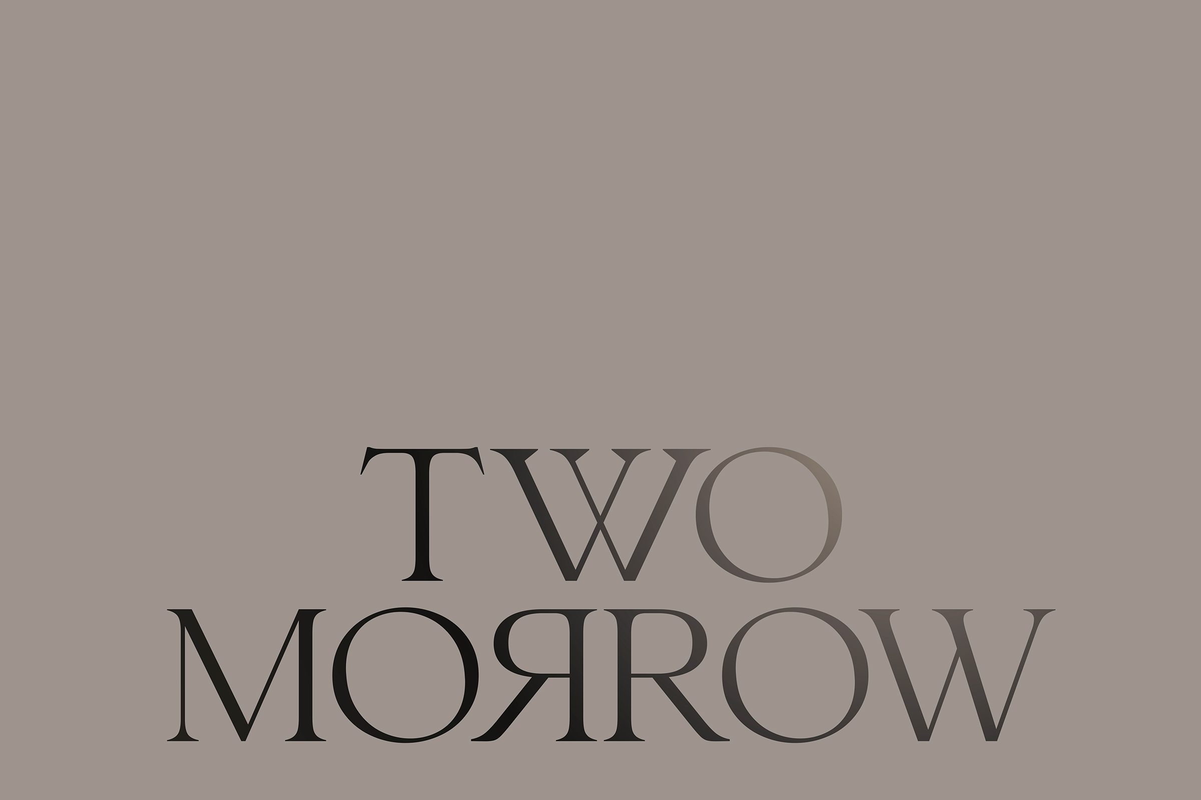
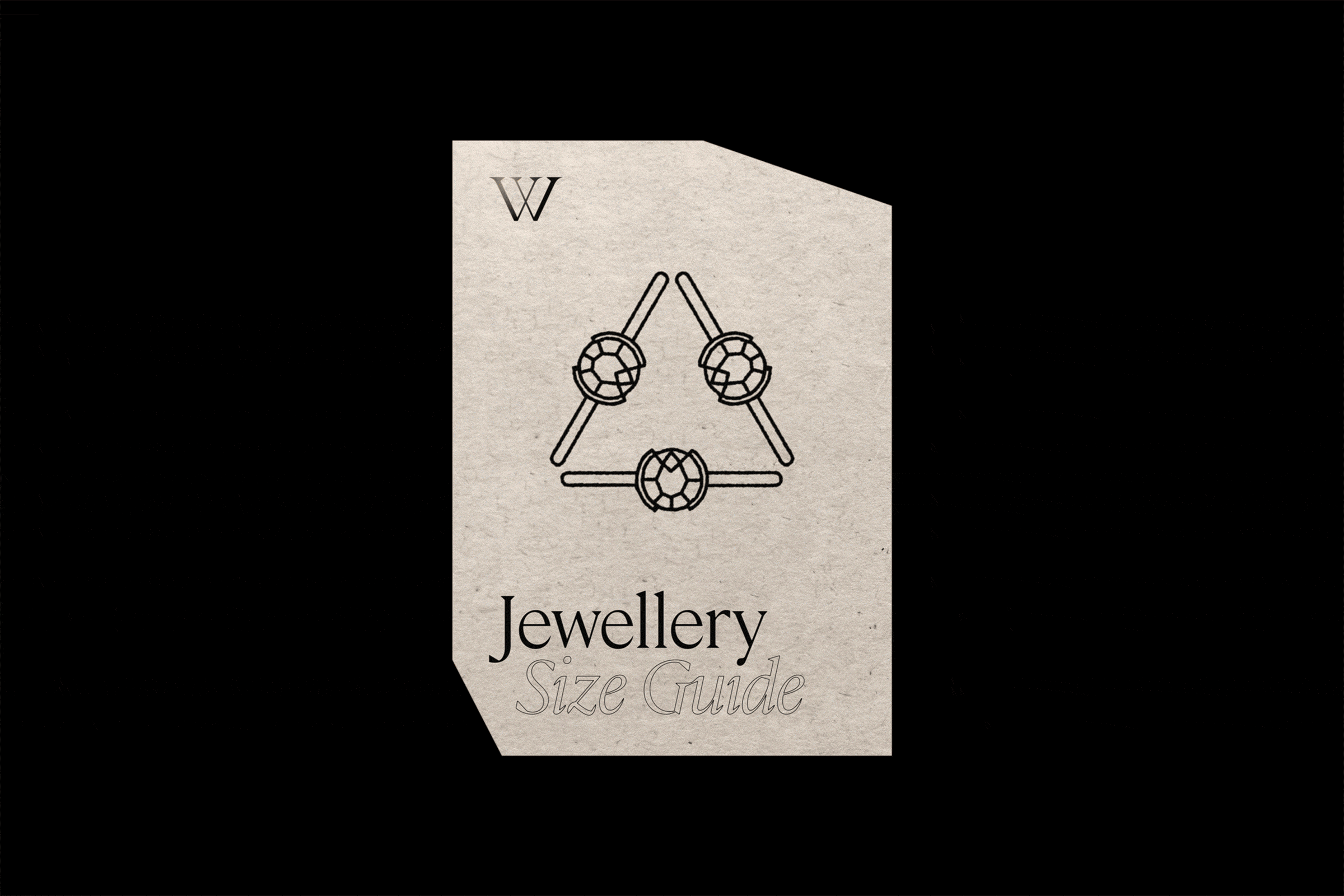
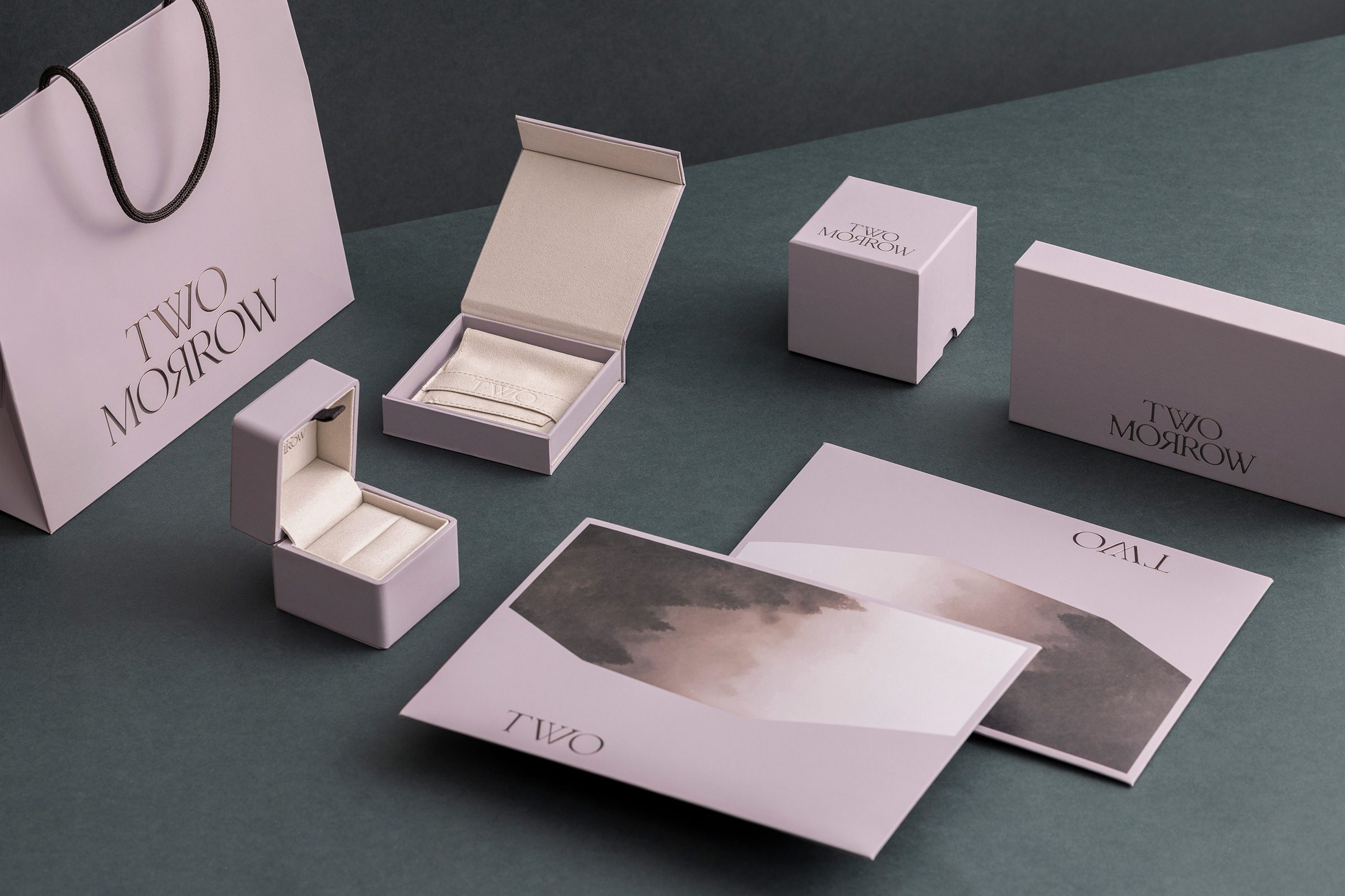
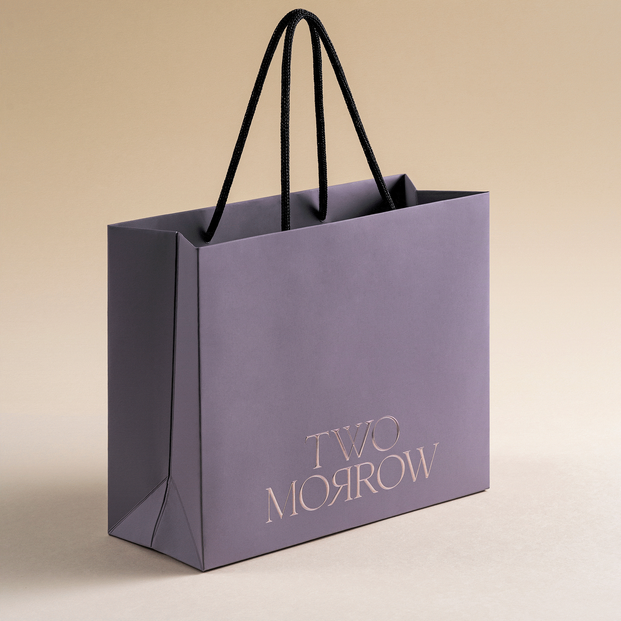
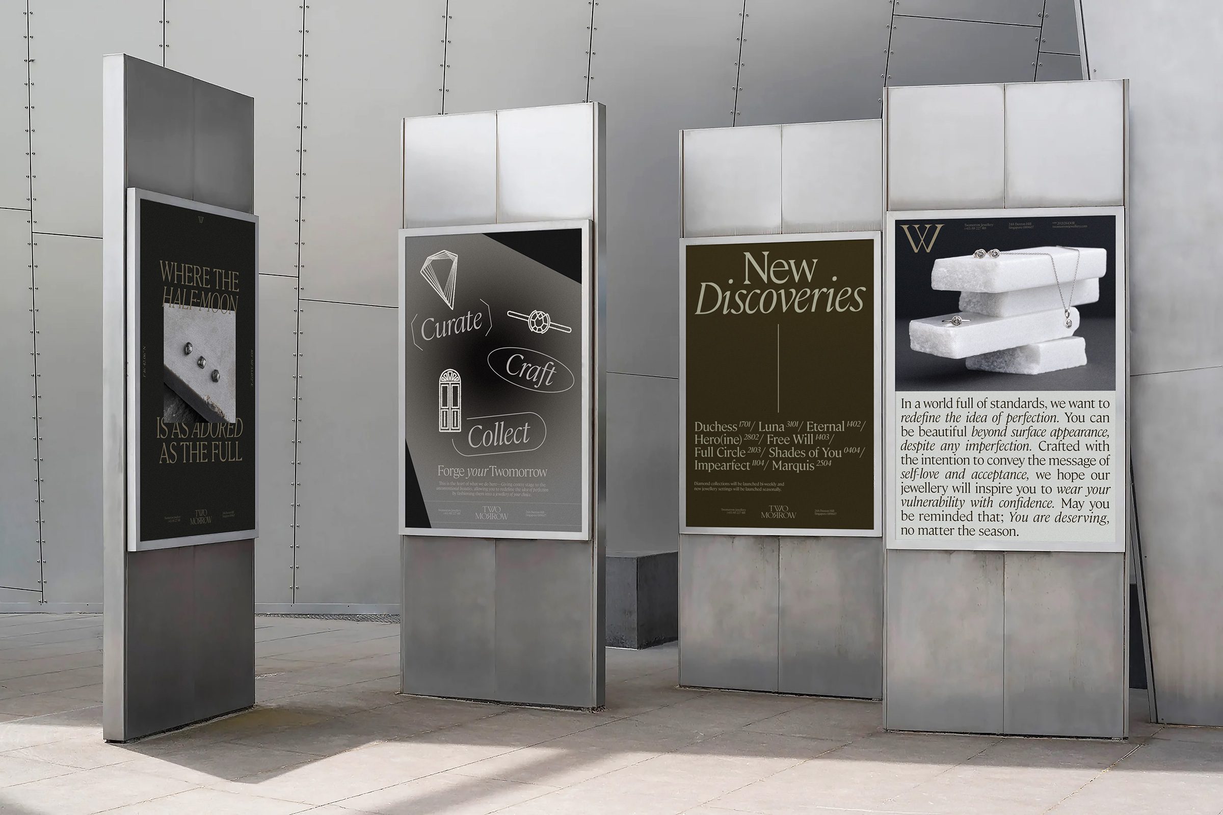
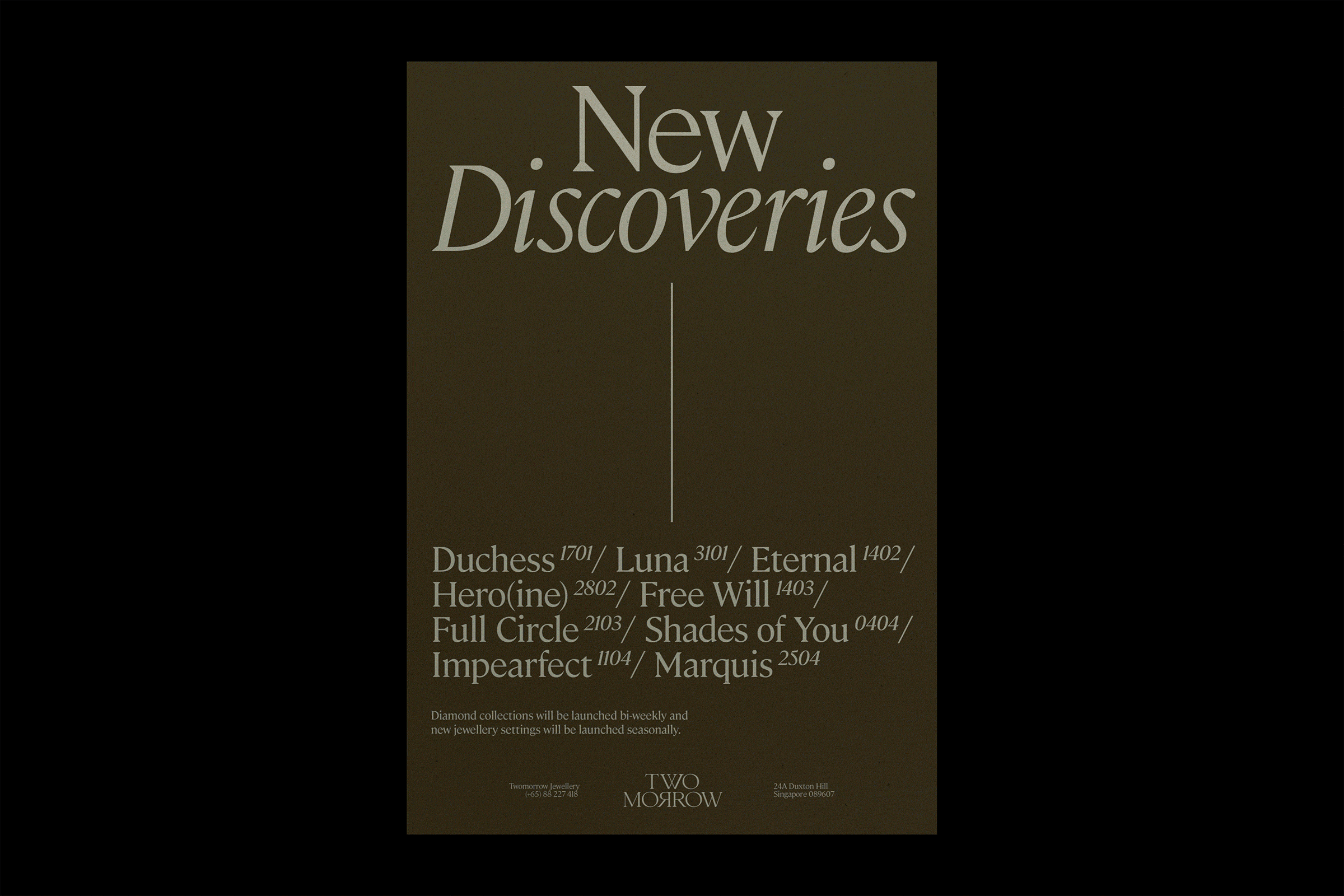
With this distinctive brand proposition, the identity design breaks the letterform into a stacked typography placement, with a diamond silhouette integrated within the negative space of the ‘W’, and a mirrored ‘R’ underneath, which represents the reflective qualities of these imperfect stones. The brand campaign spans across a wide range of design applications, including its website, stationery, packaging, posters, illustrations, and guidebooks.
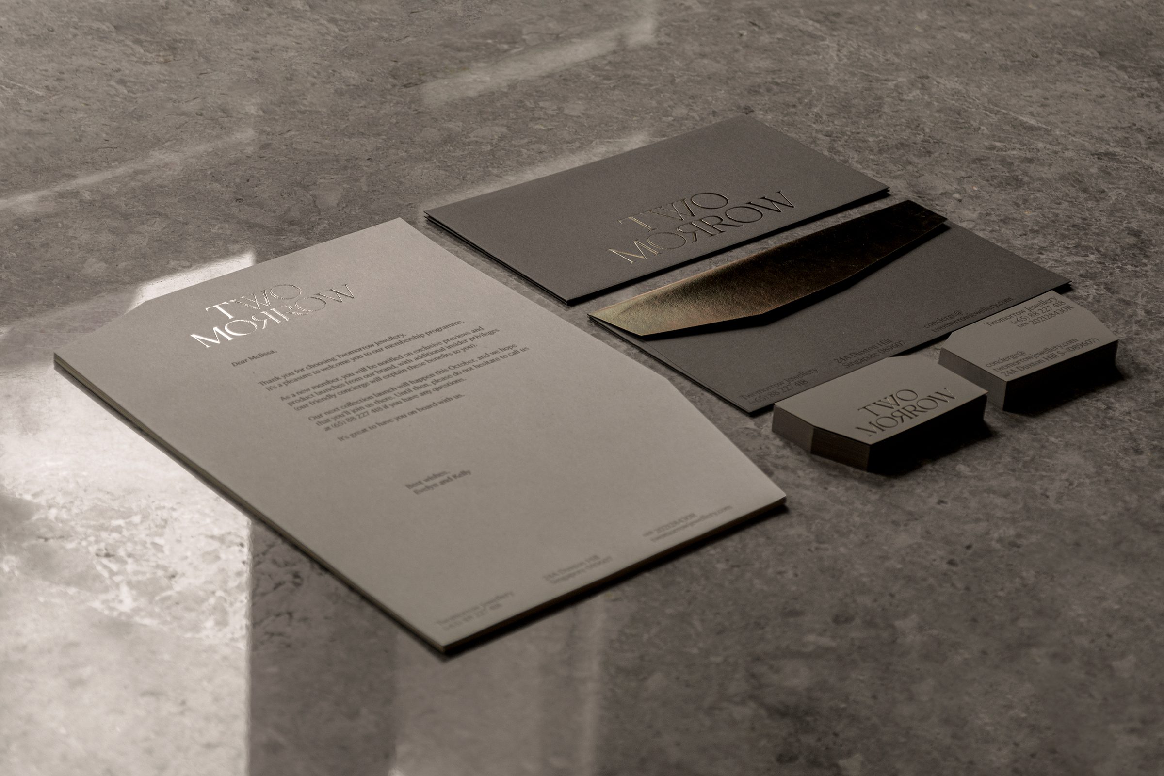
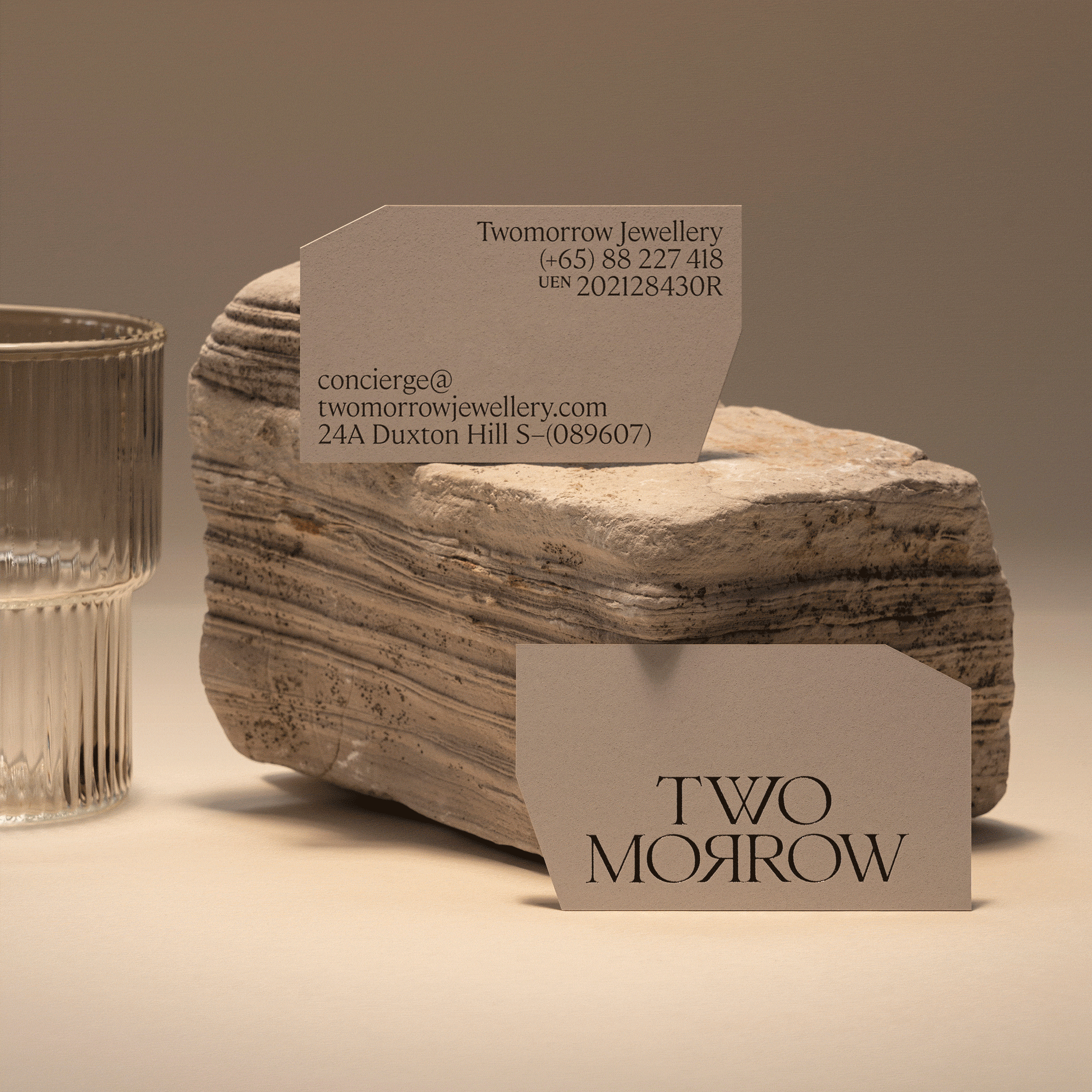

Paying homage to the heritage of the precinct, a cohesive palette of earth-inspired colours, accentuated with a tranquil lilac, is paired with the crisp Cambon typeface—which has angular qualities similar to a diamond’s facets. These irregular edges are consistently applied across the printed collaterals as well, landing on a precise, uniformed art direction. The abstract pill- and irregular-shaped outlines take inspiration from the Atelier’s architecture and award-winning interiors.
Diving deeper into Twomorrow’s ideology of imperfections, the illustrations are hand-drawn and scanned, adding a softened, meticulous touch to its chiselled appearance. Through the clients’ bespoke creations, the brand experience strives to remind the world that: They are beautiful beyond surface appearance, and beautiful even when they don’t conform to societal norms.

Completed in 2022.
Photography by Studio Periphery and House of Adjaycent.
Interiors by Right Angle Studio.
Web Development by Lord Acuña.